
Civic Suds
Determined to capitalize on a space and industry that hasn’t seen innovation but has plenty of opportunity, Civic Suds is looking to bring learning and opportunity to folks who rely on laundromats regularly to wash their clothes. The startup proposes that bringing training partners into that space will enable customers to capitalize on their time and learn about topics that will help them and the community grow.
[NPo, web design, PM]
check out the prototype

// brief
Civic Suds is looking to connect its users with training partners in a space that will enable customers to capitalize on their time and opportunities. Yet, there is currently no way to do so. This sparked the question - how can we connect Civic Suds’ users and training partners?
Build a functional and interactive booking platform on which users and training partners are able to browse, book, and host local community events while developing a trusting relationship with Civic Suds, through clear communication and reliable support.
primary role
PM
function
Team Leadership, Strategy, Project Management
timeline
2022
// initial site audit
The existing website lacks functionality and information.
We began the design process by conducting a site audit on Civic Suds’ existing website to better understand our client and their strengths and weaknesses. We discovered that the existing website has 4 major heuristic violations.
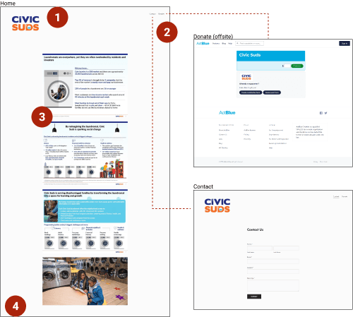
Has no primary navigation.
Has no information on its Contact and Donate pages.
Lacks actionable items and missing clear mission statement.
Has no footer and no mention of 501(c)(3) status.
// the main insights
Communication, Functionality, and Trust!
We plotted our findings from user interviews into an affinity diagram to identify key trends and pain points. Here’s what our users had to say:
users expressed importance of clear communication and reliable support
users mentioned positive experiences when using a calendar to keep track of and/or book events
users stated they would not donate to Civic Suds because of lack of information and trust
// persona development
Margaret is 27 years old and works as a housekeeper. She is a single mother of 2 children. She grew up in part of the underserved community in Philadelphia. She is currently working as a housekeeper for the local motel. She goes to her local laundromat once a week. Margaret does the best she can for her family, but she doesn’t have the support she needs to reach her goals and ambitions.
"I’m always looking for learning opportunities in my community."
[challenges]
Finding opportunities for self-growth
Making enough money to support her family, go back to school
[goals]
Make a better life for her kids through her own education
Have a safe environment to go to for support with her kids
// problem statement
Margaret needs an efficient and reliable way to find and sign up for helpful local community events so that she can grow and provide a better life for herself and her children.
// user flow
Multiple ways to engage with events.
We created user flows to help us streamline the navigation system of our solution. Our goal with this user flow is to have multiple ways for our user to engage with events on our website.

// site map
Forming the blueprint of our solution.
We conducted card sorts and tree tests to validate our design decisions and streamline our website’s navigation. We translated our findings into a site map which served as the skeleton of our design.

// site map
Leveraging teamwork into ideas!
Keeping the user persona in mind, we organized a design studio session to ideate for the main pages of our proposed solution. We all sketched our ideas for various pages throughout the website. Next, we took the best ideas from each sketch and applied it to our initial digital wireframes.

// usability testing
After sketching out initial wireframes with consideration of the user flow, site map, and design, I transitioned to mid-fidelity wireframing to prepare for usability testing.

4 major improvements made to our design.
We conducted usability testing with 5 users to gather feedback and recommendations. We conducted both moderated and unmoderated usability tests to validate our design decisions.
1. We changed “add to calendar” button to “book event” button. We also changed the placement, based on our users telling us it would help visibility by having it closer to the calendar.

2. We switched the chat box icon from a blue outline with a white fill to a blue fill with a hollow question mark in order to afford more visibility.

3. To make our sign in process less redundant, the site now takes users straight to the sign in page, with the ability to click “create account” if they need to.

4. We added a “confirm” button to afford more clarity to our users once they book an event.

// final findings
To further validate our design decisions, we decided to conduct more usability testing. Our goal was to focus on finding out whether our redesigned website is effective and efficient. How easy it is to use. If there were any difficulties during interaction. And how likely are the users to actually make use of the website.
All users stated they would use our design to engage in community events.
[Prioritizing Users Needs]
100% of users quickly and accurately completed each task. Users mentioned the tasks were straightforward and they had no problems finding the necessary landing pages.
[Establishing Trust & Transparency]
100% of users felt that the redesigned website established more trust and transparency between the business and users than the current website. All users stated they would use this platform to engage in community events.
[Clear & Intuitive Navigation]
100% of users thought the website navigation is clear and intuitive. The language is easy to understand and the actionable items have purpose and meaning. The design is consistent and follows good design principles.
check out the prototype

// learnings and takeaways
Learn to leverage the strength of teamwork.
It was an amazing experience to work with such a dynamic team. We learned to not be afraid to lean on each other and leverage the strength of teamwork. As this was an unfamiliar topic to each of us, we learned to dig deeper into our research. We listened to our users and prioritized our decisions based on their needs. The overall experience felt immensely rewarding.
view more work